As fall ushers in crisp air and shifting light, the colors we surround ourselves with make all the difference. This season, interior design is falling deeply for two rich, grounded tones: earthy greens and warm browns. They’re not just shades—they’re feelings: peaceful, soulful, rooted. Whether you live in a bustling city loft or a cozy cottage, these hues make rooms feel calm, connected, and timeless.
Let’s walk through how to embrace this palette in your home—step by step, layer by layer, with styling insights that turn trendiness into livability.
Why Earthy Greens & Warm Browns Are Falling-in-Love Favorites
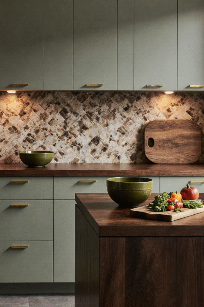
Green is the new “neutral.” HGTV Home by Sherwin-Williams named Quietude, a calming sage-green with blue undertones, as their 2025 Color of the Year Real Simple. It’s lush, soft, and neutral—perfect for creating a serene base that plays nicely with wood, brass, or warm terracottas.
Brown is having a revival. Far from outdated beige, designers are now leaning into soft caramels, cinnamon hues, and chocolate tones. Think New Hollywood warmth—Dakota Johnson’s home renovation leaned into layered shades of brown, terracotta, and moss for a grounded, elegant feel Homes and Gardens.
Color trend reports steer us even deeper: earthy tones like olive, terracotta, mushroom taupe, and soft amber are dominating fall interiors cityfurniture.commy-home-ideas.comHome Evaly.
So why this duo? Because green and brown together mirror nature. It’s a palette that invites peace, style, and authenticity.
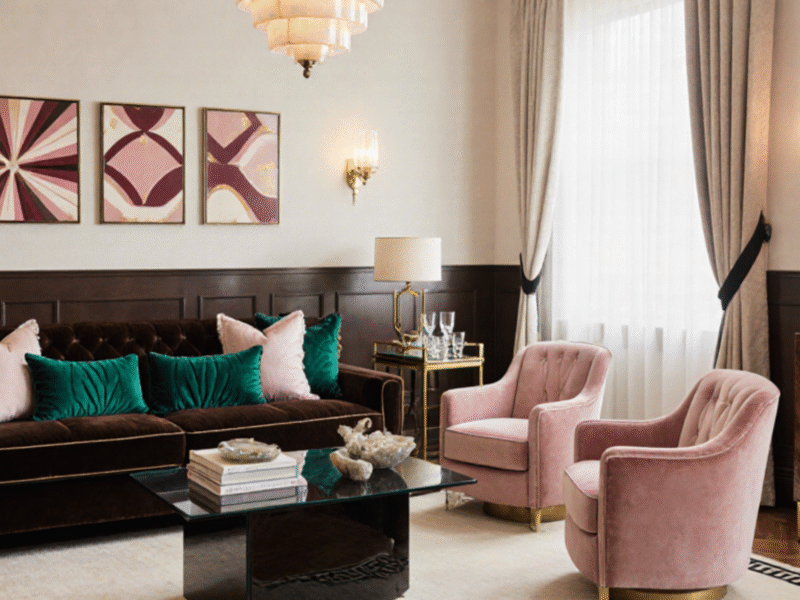
1. Start with the Walls—or a Key Accent
Design Principle: Use sage or olive as a soft backdrop, or go bold with a chocolate-brown accent wall.
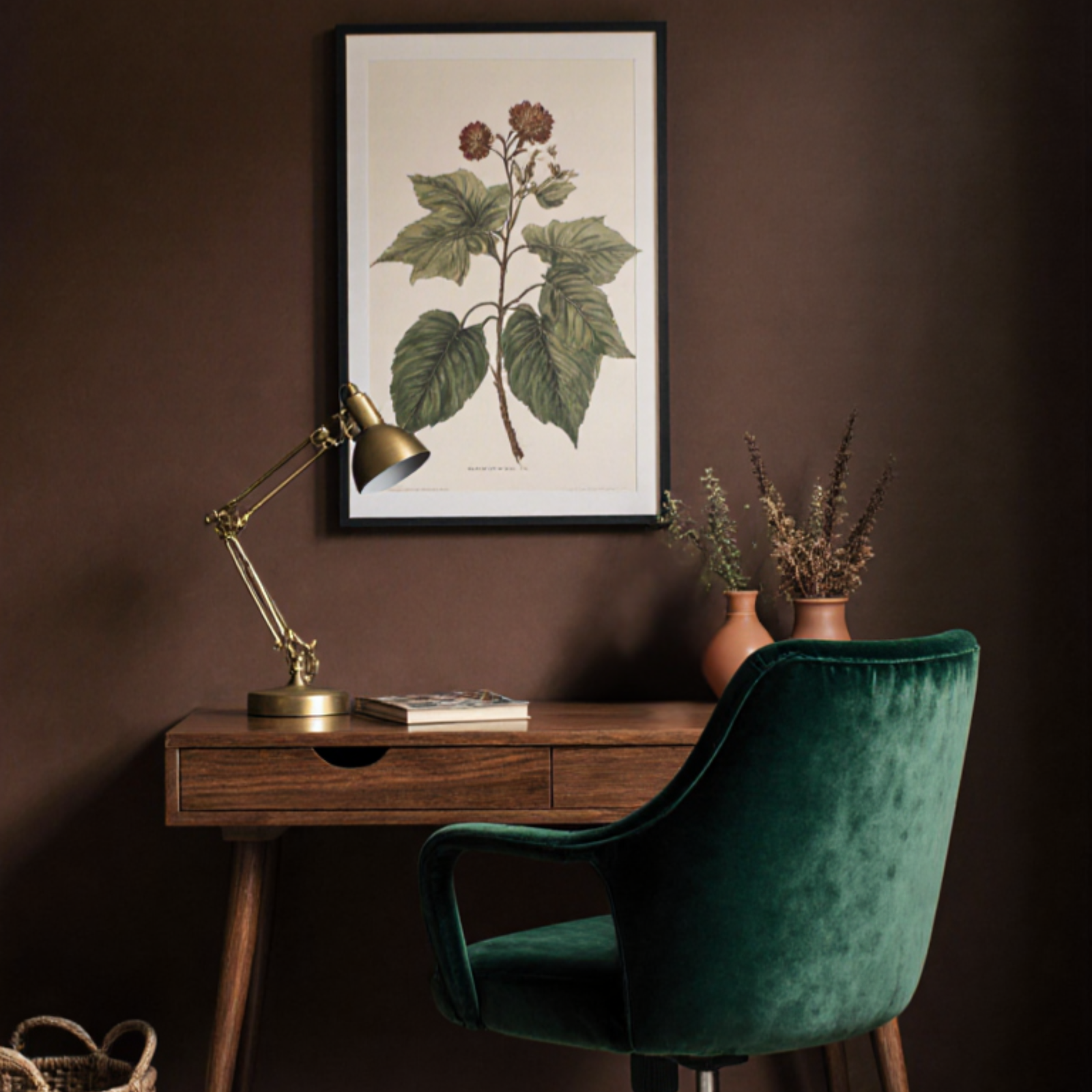
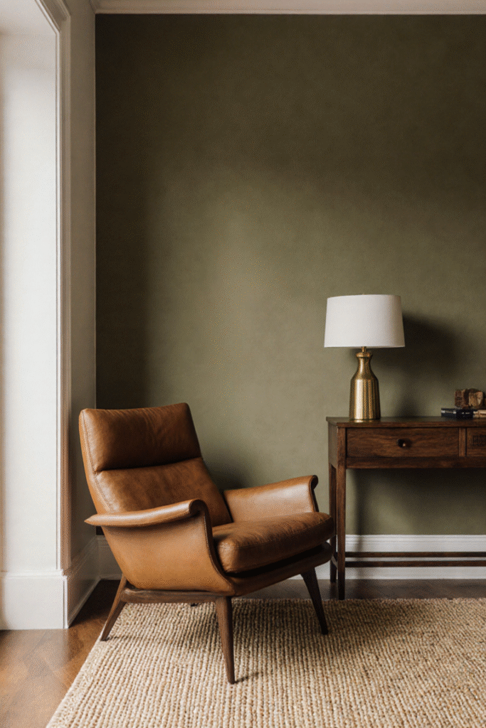
Styling Tip: A muted olive wall—the hue of quiet forests—is perfect behind sofas or bedheads. Pair it with crisp white or cream trims for contrast. If you prefer drama, a walnut chocolate wall invites depth and coziness in entryways or behind consoles.
This color marriage is sophisticated and seasonless—great for living rooms, home offices, or even guest rooms.
2. Layer in Textile Tones That Echo the Palette
Design Principle: Let textiles do the color storytelling—through texture, not only hue.
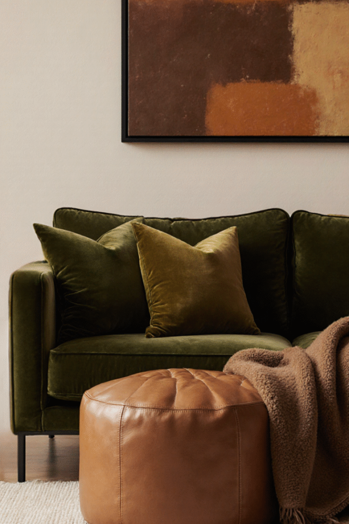
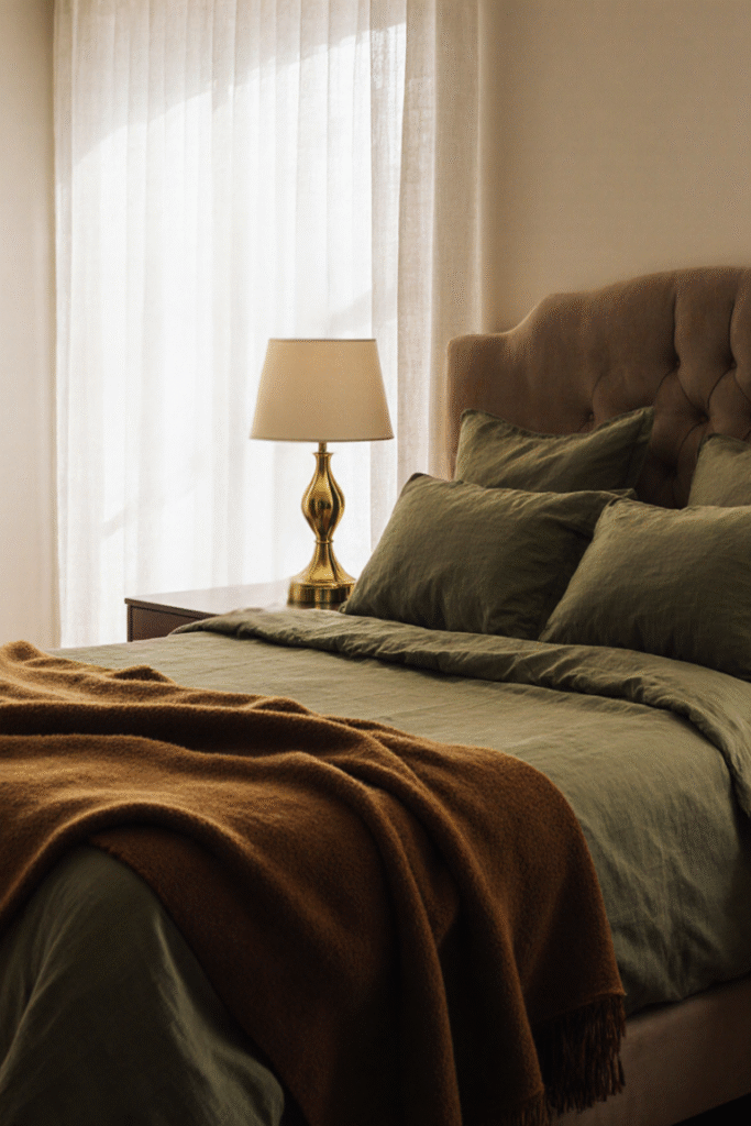
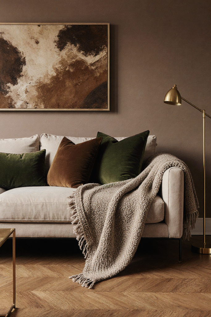
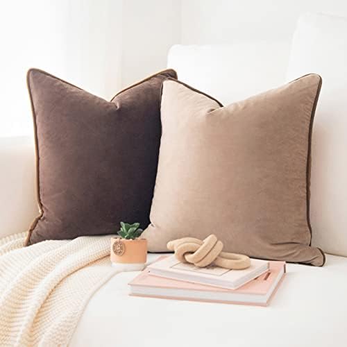
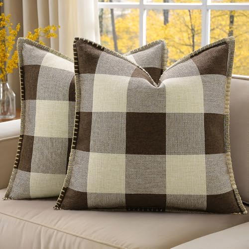
Styling Tip: Cushions in burnt amber, mushroom taupe throws, or a soft moss-green boucle pillow all nod to the trend without shouting. Fabric layering gives depth and comfort—think wool, velvet, bouclé, or linen weaves.
Want a subtle shift through the seasons? Swap chocolate-brown velvet cushions for caramel shades, or swap green linen drapes for clay terracotta—easy and budget-friendly.
3. Go Green with Purposeful Furniture and Accents
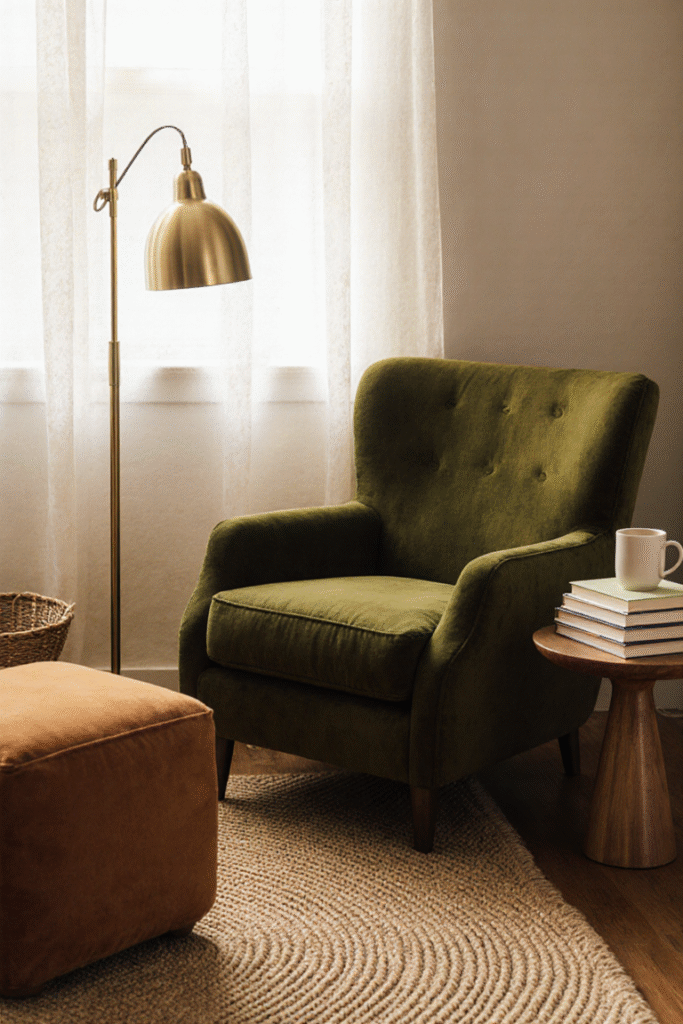
Design Principle: Bring in strategic pops of green to create rhythm and cohesion.
Styling Tip: An olive velvet swivel chair or vintage-style chest stained in deep green becomes both functional and stylish. Brass or bronze hardware complements beautifully. For smaller spaces, a moss-green vase or planter can do the same job—no heavy investment but big visual return.
4. Bring in Warm Brown Furniture Anchors
Design Principle: Furniture in caramel or walnut anchors the palette, creating visual warmth without heaviness.
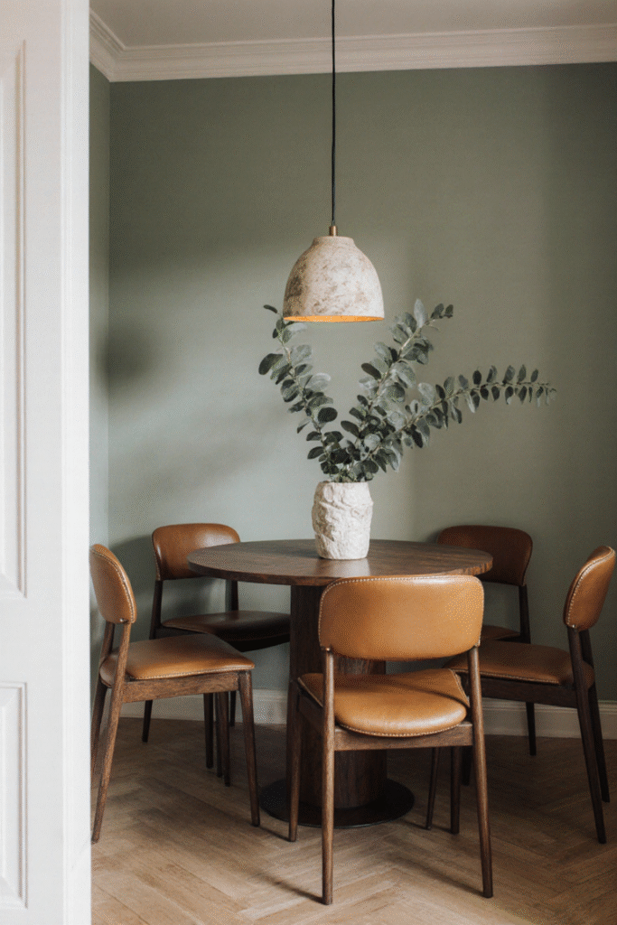
Styling Tip: A low-seated sofa in warm taupe, a leather armchair in caramel tones, or a wooden console with honeyed finish acts as anchor points. Pair these with green accents (like a seeded eucalyptus bunch) and textured neutrals on walls or cushions to keep it balanced.
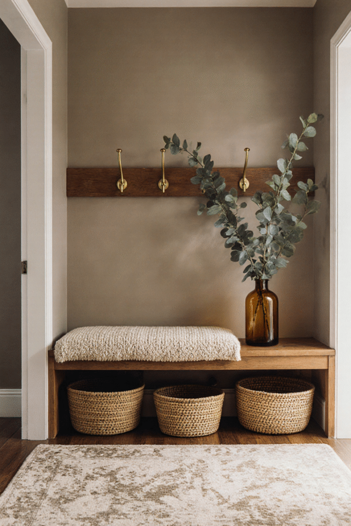
5. Add Natural Textures & Organic Elements
Design Principle: Soften color with natural materials and tactile accents.
Styling Tip: Think stone coffee tables, travertine or ceramic vases, jute rugs, or woven basket planters. These give earthy tone counterparts and bring unity. Stone and wood texture contrast the smoother, saturated tones—making them read more intentional and slept-in, not staged.
6. Use Accent Lighting to Enliven Color
Design Principle: Light changes everything—greens glow richer; browns feel deeper; everything looks softer.
Styling Tip: Position warm bulbs (2700K) near upholstered pieces. Highlight a green armchair with a brass floor lamp, or place a candle on caramel-toned furniture. Light brings out undertones and opens up darker colors.
7. Dial Up Seasonal Decor—Setting the Mood
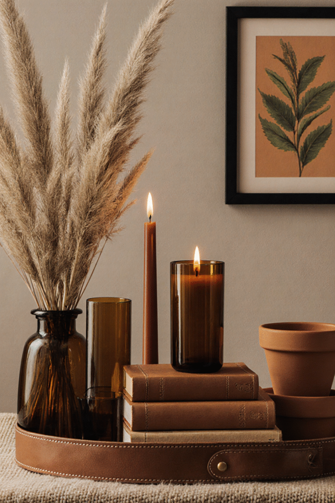
Design Principle: Accent decor locks in the seasonal soul of the palette.
Styling Tip: In fall, bring in dried grasses, amber glass candles, clay pots, or framed botanical prints in olive/ochre tones. Stack books in terra-cotta covers, cover trays with brown leather, and let the depth of the season shine through.
8. Let Trim and Ceilings Whisper the Palette
Design Principle: Even trim or ceiling color matters—it grounds the palette.
Styling Tip: Paint window frames or baseboards in soft taupe or mushroom to tie your living space together. If you’re feeling adventurous, try an olive-toned ceiling in a small bedroom or reading nook—it frames the sky while cocooning the walls.
9. Infuse Mood with Art and Accessories
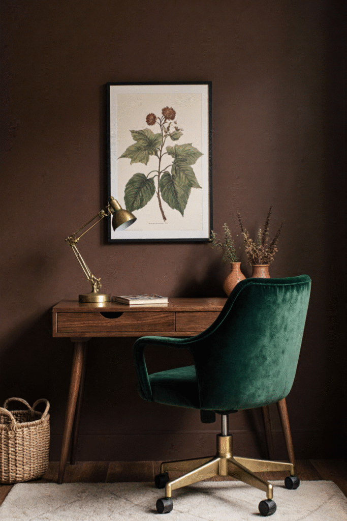
Design Principle: Let art reference the palette—you’re weaving narrative, not matching exactly.
Styling Tip: Landscape prints or abstract canvases with green and brown undertones amplify your palette without clashing. Even sculptural ceramics in clay brown work as calm punctuation.
10. Create “Quiet Luxury” Layers
Design Principle: Combine texture, tone, and light for a quietly elevated look.
Styling Tip: Think layered privacy (linen curtains dipped in olive, with sheer white behind), soft pillows, tactile throws, honest materials like unpolished brass, leather, and wood. It’s elegant design, not overt luxury. Designers are leaning into this mood in 2025 Architectural Digest.
Final Thoughts
Cozy, grounded, and serenely stylish—earthy greens and warm browns fit 2025’s mood better than any flashy trend ever could. They bring the tranquility of nature inside, help us feel rooted, and give every room a seasonal whisper of comfort.
Start small—maybe a pillow, a lamp, or a throw. Let the colors grow gradually, like a forest turning in the fall. Your home will become a haven, and each layer will reflect thoughtful design—never forced, always flowing.
Recommended products


This post may contain affiliate links.I may earn a small commission if you purchase through these links,at no extra cost to you.If you decide to make a purchase through one of these links.I only recommend products I actually use or genuinely believe will bring value.Thanks for the support!